Mastering the Layout UI Component with JavaScript
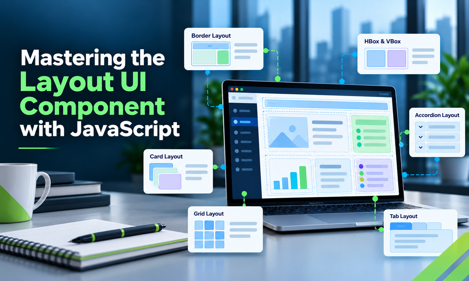
A well-structured interface is easier to maintain, extend, and adapt to different screen sizes. As JavaScript applications grow, however, layouts can become increasingly complex.
A page may start with a header and a content area, then evolve to include navigation panels, forms, charts, data grids, and nested views. Managing how all these components fit together requires a consistent layout strategy.
This guide covers the main React grid layout patterns, when to use native CSS, and how component-based layout systems can help with complex applications.
1. What Is a UI Layout Component?
A layout component controls the arrangement of other UI components.
Depending on the layout system, it may define:
- The direction in which children are arranged.
- How available space is distributed.
- How panels respond to resizing.
- Which child view is visible.
- How regions collapse or expand.
By separating layout from content, developers can change the structure of a screen without rewriting every component inside it.
2. Understand Common React Layout Patterns
Horizontal layout
Horizontal layouts arrange components from left to right. They are useful for toolbars, split panes, and side-by-side content.
Vertical layout
Vertical layouts stack components from top to bottom. Common examples include headers above content and forms with vertically arranged sections.
Border layout
Border layouts divide the available space into regions such as top, bottom, left, right, and center.
This pattern is useful for administrative applications where navigation and details surround a central workspace.
Card layout
Card layouts display one child view at a time. They are useful for multi-step workflows and applications that switch between different views.
Fit layout
A fit layout allows a child component to occupy the available space in its container. It can be useful when a grid or chart should fill the central region of a workspace.
3. Use CSS Grid and Flexbox for Straightforward Layouts
Native CSS is sufficient for many applications.
.application {
  display: grid;
  grid-template-columns: 220px minmax(0, 1fr);
  gap: 16px;
}

.main-panel {
  min-width: 0;
}

This creates a sidebar and a flexible main panel without a JavaScript layout dependency.
CSS Grid is especially useful for two-dimensional arrangements, while Flexbox is a natural fit for many horizontal or vertical component groups.
For simpler interfaces, these browser-native tools are often the easiest solution to maintain.
4. When Should You Consider a Layout Framework?
A dedicated layout framework may be worth evaluating when your application needs:
- Multiple nested panels.
- Collapsible navigation regions.
- Resizable split panes.
- Centralized component sizing.
- Layouts integrated with a larger UI component ecosystem.
- Consistent patterns across many complex screens.
Sencha's Ext JS provides layout managers such as hbox, vbox, border, fit, and card.
These can help organize complex business interfaces in which data grids, charts, forms, and other components must work within a coordinated layout.
For React applications, ReExt integrates Ext JS components into the React environment, making it another option to consider when the Ext JS ecosystem fits the project's requirements.
5. Make Responsive Behavior Part of the Design
A layout should account for changing screen dimensions from the beginning.
Use flexible sizing where appropriate, define sensible minimum dimensions, and decide which regions should collapse or change their presentation on smaller screens.
Test how the interface behaves when:
- A sidebar is collapsed.
- A details panel is resized.
- The main content contains a large grid.
- Labels or data values are longer than expected.
- Loading and empty states are displayed.
- The viewport becomes narrow.
Responsive behavior involves the interaction between containers and their children, not just media-query breakpoints.
6. Separate Layout, State, and Business Logic
Keep each layer responsible for its own concerns.
- Layout components control positioning and sizing.
- Content components render forms, tables, charts, and other UI elements.
- React state coordinates shared application information.
- Data services handle API requests and persistence.
This structure helps prevent layout code from becoming tightly coupled to business logic.
It also makes the application easier to test because each responsibility can be evaluated independently.
7. Common Layout Mistakes
Avoid excessive nesting, which can make sizing relationships difficult to debug.
Avoid fixed widths and heights everywhere, especially for main content regions that must adapt to different screens.
Do not assume that child components will automatically resize correctly when their parents change dimensions. Test the behavior explicitly.
Finally, choose a layout framework based on actual requirements, not simply on the number of components it offers. Consider performance, accessibility, documentation, licensing, and maintenance costs.
Conclusion
Effective JavaScript layouts start with clear component relationships and a sensible separation of responsibilities.
CSS Grid and Flexbox are excellent foundations for many interfaces. For complex enterprise applications, layout managers can provide structured patterns for nested panels, resizing, and coordinated component behavior.
The best solution is the one that meets your application's needs without adding unnecessary complexity.
Further reading: Master the Layout UI Component with JavaScript
Comments
Join the discussionNo comments yet. Be the first to comment.