How to Create a Responsive Grid in React: A Developer's Guide
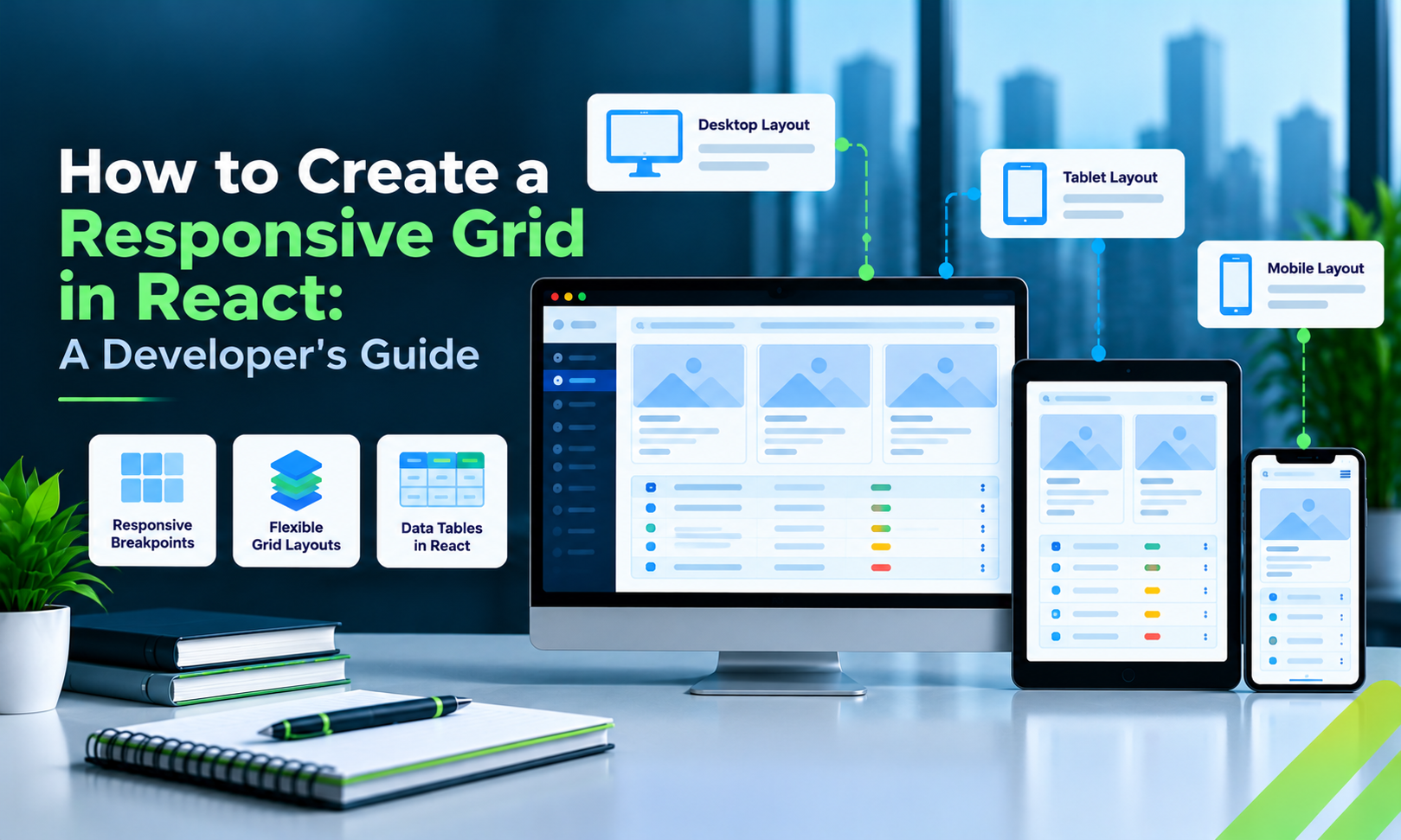
Responsive grids help React grid layout adapt to desktop monitors, tablets, and mobile screens. But building a grid that fits the viewport is only part of the challenge. The interface must also remain readable, accessible, and efficient when the available space changes.
The best implementation depends on whether you're arranging page content, building a customizable dashboard, or displaying a large dataset.
1. Choose the Right Grid Approach
Before selecting a library, identify your use case.
Grid type | Best suited for |
CSS Grid | Responsive cards, page sections, and content layouts |
Flexbox | Toolbars and one-dimensional arrangements |
React Grid Layout | Draggable and resizable dashboard widgets |
Data-grid component | Interactive tables with sorting, filtering, and editing |
These approaches can complement one another. A dashboard may use CSS Grid for the page structure, a layout library for movable widgets, and a data grid inside one of those widgets.
2. Create a Responsive Grid with CSS
CSS Grid provides a lightweight way to build responsive layouts.
.responsive-grid {
  display: grid;
  grid-template-columns: repeat(
    auto-fit,
    minmax(220px, 1fr)
  );
  gap: 16px;
}
A React component can render the content dynamically:
function ResponsiveGrid({ items }) {
  return (
    <div className="responsive-grid">
      {items.map((item) => (
        <article key={item.id}>
          <h3>{item.title}</h3>
          <p>{item.description}</p>
        </article>
      ))}
    </div>
  );
}
The browser determines how many columns fit while maintaining the minimum width defined by minmax().
This approach is appropriate for cards, product listings, and many dashboard content sections.
3. Use Breakpoints When the Layout Needs Explicit Changes
Some interfaces require more control over how content changes at different widths.
.grid {
  display: grid;
  grid-template-columns: repeat(3, minmax(0, 1fr));
  gap: 16px;
}

@media (max-width: 900px) {
  .grid {
    grid-template-columns: repeat(2, minmax(0, 1fr));
  }
}

@media (max-width: 600px) {
  .grid {
    grid-template-columns: 1fr;
  }
}
This creates three columns on larger screens, two on medium screens, and one on narrow screens.
Choose breakpoints based on the content's minimum usable width. Avoid assuming that a layout will work simply because it matches a familiar device category.
4. Make Data Grids Mobile-Friendly
Data grids require additional planning because their columns often contain essential business information.
Common responsive strategies include:
- Hiding secondary columns while preserving access to their information.
- Allowing horizontal scrolling when comparing columns is important.
- Presenting each record as a card on narrow screens.
- Providing column visibility controls for data-intensive interfaces.
- Maintaining accessible sorting, filtering, and editing interactions.
The correct strategy depends on how users work with the data. Comparing many records requires a different experience from viewing the details of one record.
5. Add Dashboard Responsiveness
If users need to drag and resize widgets, a dedicated dashboard-layout library can simplify the implementation.
React Grid Layout is an option for arranging panels and defining different layouts at responsive breakpoints.
For example, a desktop dashboard might display two charts side by side, while a mobile layout stacks them vertically.
Keep in mind that responsive dashboard positioning and data-grid behavior are separate concerns. A layout library does not automatically provide advanced table functionality.
6. Evaluate Enterprise Data-Grid Requirements
Business applications may require much more than a responsive appearance.
Consider whether the grid needs:
- Sorting and filtering.
- Inline editing and validation.
- Server-side pagination.
- Column resizing and visibility.
- Grouping and summaries.
- Virtualization for large datasets.
- Keyboard navigation and accessibility.
Sencha's ReExt integrates Ext JS components into React applications. It is an option to evaluate when enterprise applications need data grids alongside charts, forms, and other UI components.
For simpler interfaces, a native table or lightweight React table library may be sufficient. Choose according to your actual requirements, licensing, performance needs, and maintenance budget.
7. Optimize Performance
Responsive design should not come at the cost of unnecessary rendering.
For large tables, use virtualization or server-side pagination when appropriate. Avoid recreating expensive grid configuration unnecessarily, and verify that the component resizes correctly when its parent container changes.
Test with realistic datasets and ensure that sorting, filtering, selection, and editing remain functional at different viewport sizes.
8. Responsive Grid Checklist
- Identify whether you need a layout grid, dashboard grid, or data grid.
- Use CSS Grid or Flexbox for straightforward layouts.
- Define breakpoints according to content requirements.
- Decide how table columns should behave on mobile.
- Test nested components when parent containers resize.
- Evaluate virtualization and server-side pagination for large datasets.
- Test keyboard accessibility and touch interactions.
- Compare libraries based on features, compatibility, licensing, and maintenance.
Conclusion
A responsive React grid should adapt both its layout and its interactions to the available space.
CSS Grid is an excellent starting point for content layouts. React Grid Layout can help with customizable dashboards. Dedicated data-grid components are better suited to complex record management.
The right solution is the one that preserves usability and performance without introducing unnecessary complexity.
Read the full guide: How to Create a React Responsive Grid
Comments
Join the discussionNo comments yet. Be the first to comment.